
When deciding on the color for a much older population, the focus should be on texts as it is assumed that these population types are fully aware of the purpose of their search so the color selection can appear as mild as possible yet attract the right audience.
Here are more insights on colors:
- Consider Color Blindness: Not everyone sees colors the same way. Use online tools to check if your colors have enough contrast for people with red-green color blindness, the most common type.
- Think Beyond Color: Don’t rely solely on color to convey information. Use clear labels, icons, or different font weights to back up your message.
- Accessible for All: Ensure enough contrast between text and background colors. Dark text on a light background is generally best for readability.
- More Than Just Vision: Consider people with visual impairment. Opt for high-contrast color combinations and avoid using color alone as a call to action.
- Fonts: To ensure legibility and visibility, the ideal size for body texts should be 16 while Headings can appear in H1, H2. The font size 16 accounts for visibility, allowing the audience to scan through your design with ease. Meantime legibility is achieved when complex font types are avoided. Design is simple, do not complicate things by using a font type that is illegible and could be deemed inappropriate for the design.
- Alignment: Texts are aligned based on the importance of communicating ideas and the message’s intention. When designing a flier, the body text when aligned left, has proven to enhance legibility compared to when it is aligned in any other format (justified, right, centered). So if you are looking to draw the attention of your audience while ensuring effective communication, try as much as possible to align texts to the left, as for headings, center alignment always does the trick.
Following these seemingly basic principles will leave you with the best designs you could ever imagine. Here are some tips to follow to achieve the desired design quality.
- Visit similar flyers or websites and try recreating the designs to gain inspiration
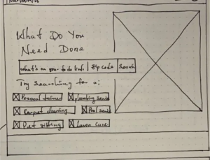
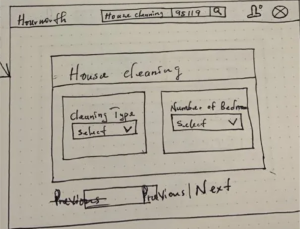
- Practice doodling for every design. This will help you keep track of every idea that pops up in your mind before the design proper.
Creating the best designs for a client can be quite a hassle for some designers. Fully understanding the client’s intentions and replicating it in design will sometimes leave you questioning your design skills. Discover simple ways to create the best designs that can possibly be in this post.
What is design?
Imagine a plan for making something awesome! That’s design “Anything from a cool website layout to a funky pair of shoes” design is anything created that communicates a client’s intention to its audience and anyone who creates such can be termed a designer.
The key steps to creating the perfect design revolve around knowing the client’s intention and audience. Understanding these easy steps will help you create the best designs.
A. Clients Intention: The client here refers to any one who needs a design for a defined audience. It could be a flier or an entire website. The purpose for a design helps you as a designer understand who the design is for in order to better choose the color or font to be used. The client’s intention resonates with its audience, who the design is meant for. From the audience, you will better adopt a font or color that matches its intention.
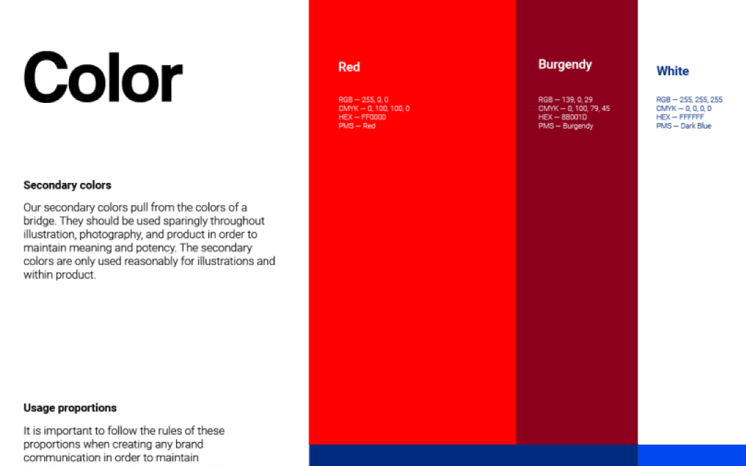
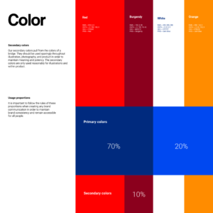
B. Colors: Ensuring the perfect color blend for a design will depend on the intended audience. Vibrant colors in a design speak to attraction. This attraction can work for kids or a younger population if the client intends to attract and convince his preferred audience. Always ensure that the brand’s color selected communicates its intentions to its desired audience effectively.
When deciding on the color for a much older population, the focus should be on texts as it is assumed that these population types are fully aware of the purpose of their search so the color selection can appear as mild as possible yet attract the right audience.
Here are more insights on colors:
- Consider Color Blindness: Not everyone sees colors the same way. Use online tools to check if your colors have enough contrast for people with red-green color blindness, the most common type.
- Think Beyond Color: Don’t rely solely on color to convey information. Use clear labels, icons, or different font weights to back up your message.
- Accessible for All: Ensure enough contrast between text and background colors. Dark text on a light background is generally best for readability.
- More Than Just Vision: Consider people with visual impairment. Opt for high-contrast color combinations and avoid using color alone as a call to action.
- Fonts: To ensure legibility and visibility, the ideal size for body texts should be 16 while Headings can appear in H1, H2. The font size 16 accounts for visibility, allowing the audience to scan through your design with ease. Meantime legibility is achieved when complex font types are avoided. Design is simple, do not complicate things by using a font type that is illegible and could be deemed inappropriate for the design.
- Alignment: Texts are aligned based on the importance of communicating ideas and the message’s intention. When designing a flier, the body text when aligned left, has proven to enhance legibility compared to when it is aligned in any other format (justified, right, centered). So if you are looking to draw the attention of your audience while ensuring effective communication, try as much as possible to align texts to the left, as for headings, center alignment always does the trick.
Following these seemingly basic principles will leave you with the best designs you could ever imagine. Here are some tips to follow to achieve the desired design quality.
- Visit similar flyers or websites and try recreating the designs to gain inspiration
- Practice doodling for every design. This will help you keep track of every idea that pops up in your mind before the design proper.